Youthlinc
view figma fileProject Overview
Youthlinc, a humanitarian service organization, works with teenagers to develop their skills so that they can provide service to their communities as well as communities across the world. Since their focus has been on helping people achieve the best of who they can be, they've been unable to keep on top of their website and are currently experiencing issues with low session lengths and accessibility. As part of a class project, I worked to make a hypothetical update to their website.
Problem Statement
Youthlinc currently has a website that is unresponsive to screen sizes and does not play nicely with very large or small screens. Furthermore, their site has contrast issues, counterintuitive elements, and broken links. Finally, its complex site organization results in hard to find information and low session lengths.
Solution
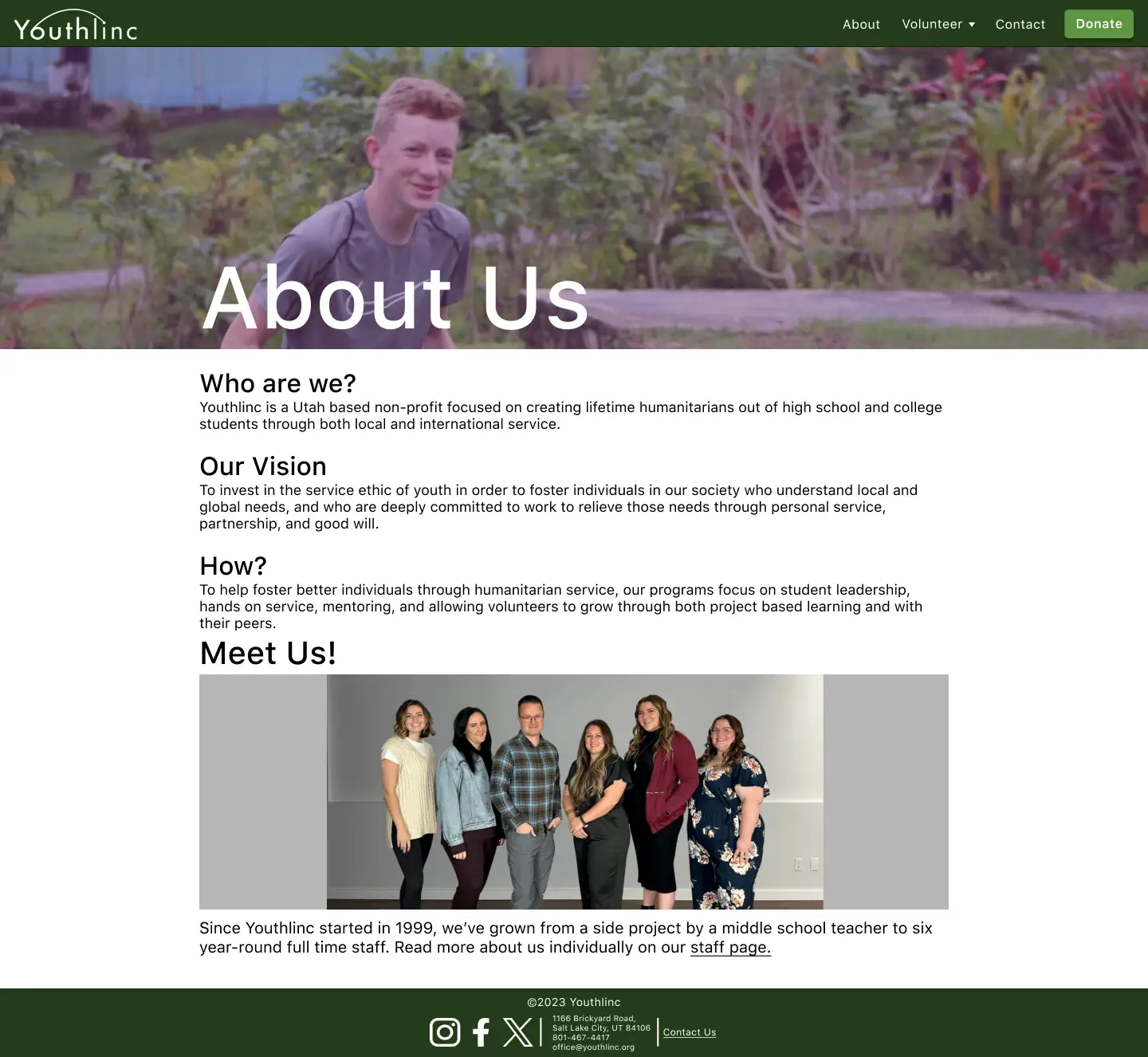
The solution includes an in-depth comp for mobile, tablet, and desktop devices that are created for easy- to-implement responsive design. The surface comp also includes typefacing, themes, and focuses on solving the contrast and element issues present in the current version.
Project Role
During this project I worked as a designer. With feedback from peers and teachers, I worked to implement a new design that would surpass project expectations and goals, while also working to solve the inherent issues found on Youthlinc's website.
Goals
To create a new design that implemented a theme that unified pages, allowed users to easily find the information they would be looking for when visiting the website, and left an impression on the user that Youthlinc was a responsible and trustworthy non-profit organization.

So What did I do?
Creating a Theme
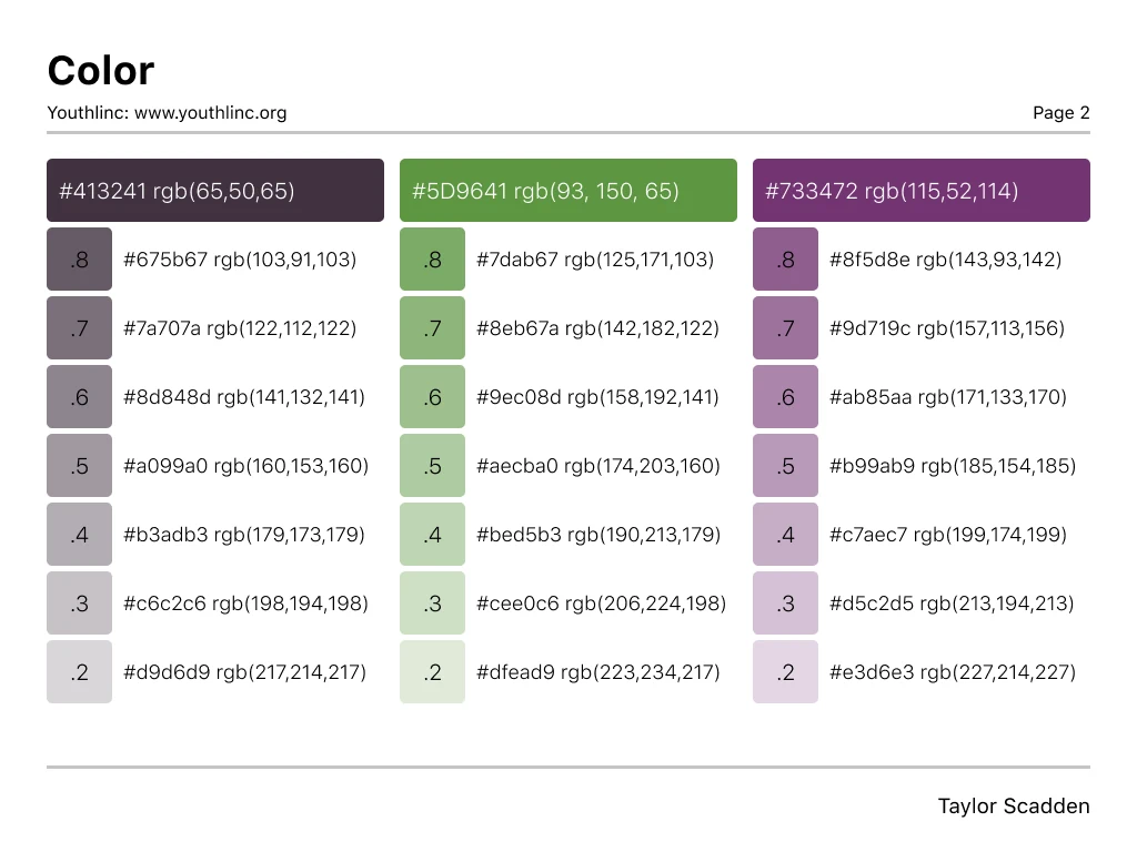
I started this project by first coming up with a theme I could use across the website to help unify the pages. Ultimately, I came up with a primarily dark green #44573B supported by a lighter green #5D9641 and a complementary dark purple #413241. I then chose to use a white #FFF background to keep the site simple and professional, while using a default black #000 for most text content. Beyond color choices, I also researched what other nonprofits in Utah were doing for their typography, and setted on choosing “SF Pro Text” due to it being easy to read, its professional impression, and ability to adapt to any weight, size, or decoration.
Research
After having chosen a theme, and creating a site guide, I began to prep for the wireframing process. I first gathered examples of other non-profit organizations in Utah whose websites I liked, noting down what exactly I liked about them and how they managed to get across lots of information effortlessly. I then gathered images of these websites into figma to help provide inspiration for when I began the actual wireframing.
Research also included a site audit to see what pages they site had, where the sites linked to and from, and to help me organize how I wanted to have the new design present the many different aspects of the website. I then combined this information into a document and added it in with the inspiration screen captures.

Wireframing
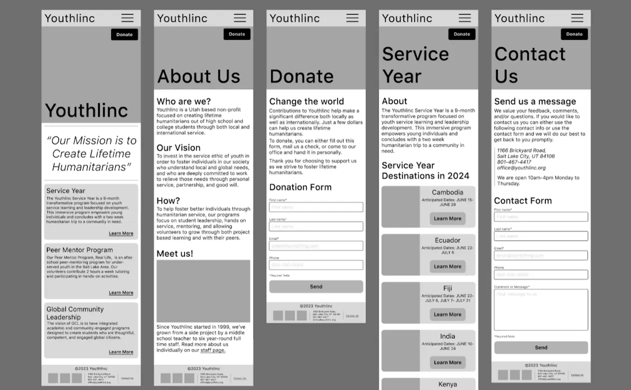
Once I had the research complete and a collection of resources gathered, I began to create different wireframes for mobile, tablet, and desktop versions of the site. I looked at trying out different styles that incorporated different methods of presenting the information so that I could decide what method would work best for this specific site.
I also shared these wireframes with peers and teachers to gather feedback on what worked and what didn't. With feedback incorporated into the different wireframes, I combined what worked best into a final wireframe that could be used to create surface comps.
First Surface Comps and Revision
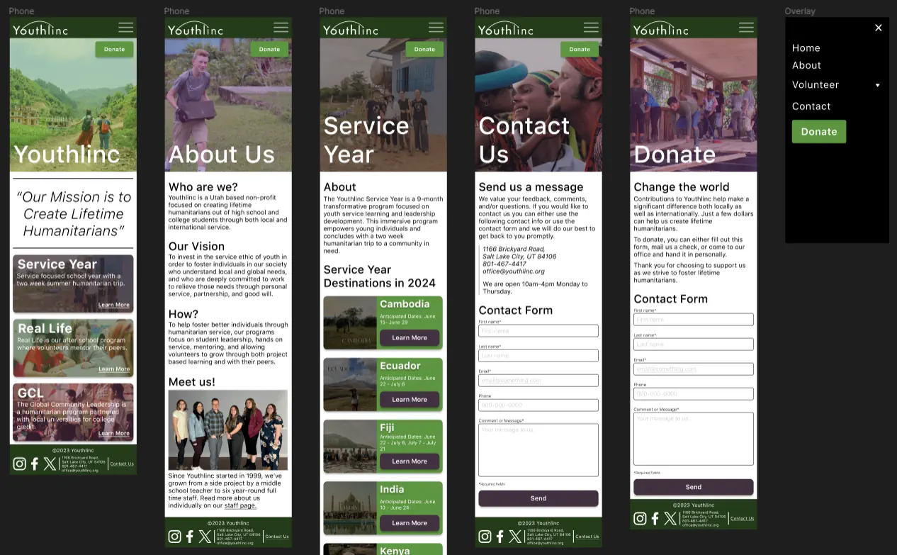
Continuing then on to the surface comps I took assets currently found on the Youthlinc website, such as photos, and added them in. I also created different cards and used different color schemes to get feedback from peers about what worked best. Once again incorporating feedback I adjusted and changed aspects of the surface comp to better fit the intended audience, target goals, and assignment expectations.

Prototyping
Having the surface comp completed, I then hooked up the different pages of the website on all three versions of the site -mobile, tablet, and desktop-, tested them for errors and/or user blockages, and looked for areas of improvement across the entire project. With the issues brought up fixed, I then looked at polishing it all up for the end of the project.
Completion and Turnin
Although the finished prototype represented a working website that fulfilled target goals, there were some things that just needed to be polished up, such as: Aligning elements to the grid; unifying typography, image overlays, and the menu overlay -so that it correctly came in on the side irregardless of size-; and adjusting elements so that they scaled correctly if one was to adjust the frame size.
With the assignment polished, I turned it in for final peer reviews and grading.

Conclusion
Possible Improvements
Having made this design a while before writing this case study, I know much more about figma now than I did then. The final design has a lot of maintainability issues due to not using styles or variables. I also didn't use components in a manner that would allow for easy editing across the entire design. The big thing, however, that I would implement now that I have much more experience in Figma, is autolayout.
Overall Final Comments
By the end of the class assignment, I had recreated a design for a Youthlinc website that had a theme, unified its pages, provided easy accessibility to information, and distinct call to actions. I made sure that the website would be responsive, from a mobile device to a large desktop screen. Finally, I created a homepage that would show all of the different services and activities that Youthlinc offers so that new users of the website would be able to see that Youthlinc offered more than just three week humanitarian missions.