Ponder.ly Homepage Redesign
view figma fileProject Overview
Ponder.ly is a startup that is looking to give companies an easier, ethical, and more accurate way to create personas for use in their design and market research systems by using AI technology. As they have grown, they've realized that their homepage needed a facelift to help its site be accessible to all users as well as appear more professional to any company considering their services.
Problem Statement
Ponder.ly currently uses WIX to provide their website hosting and design services, which limits what they can do with their website. They needed a new design that had changes that were easy to implement for a novice web developer while providing a good overall look and being accessible.
Solution
The delivered design included an in-depth comp in Figma as well as new typeface rules, comments explaining why changes were made, and suggestions for how developers could implement the new design while keeping the site responsive.
Project Role
The delivered design included an in-depth comp in Figma as well as new typeface rules, comments explaining why changes were made, and suggestions for how developers could implement the new design while keeping the site responsive.
Goals
The goal for the project was to redesign their homepage in order to create a professional experience that was more accessible to any potential user and was easily implementable.
So What did I do?
Recreating Their Website In Figma
Although it wasn't directly creating the new design, I decided to start by first recreating their Wix template website in Figma. Using the knowledge I gained from Utah Valley University's Communicating Digital Design class, I knew that recreating a website is a good way to quickly find the small things that add up to reduce user experience. As I went along creating it, I took notes of where there were obvious inconsistencies, accessibility issues, and any other problems that were causing the website to have degraded performance, compiling them into notes for shareholder meetings.
Creating the New Version
Due to the notes I took from recreating the website in Figma, I knew that there were a couple things that could easily be implemented that would provide a huge visual improvement. The first was by taking their original pictures, which were uncompressed and very large, and down scaling them at multiple different sizes so that images could still look very good, which helps loading times as well as images moving content around when it took too long to load for the user. Along the lines of Images, I recreated their logo in Illustrator, making it a SVG. This reduced the grainy logo of 63kb down to a very high quality logo at 2kb..
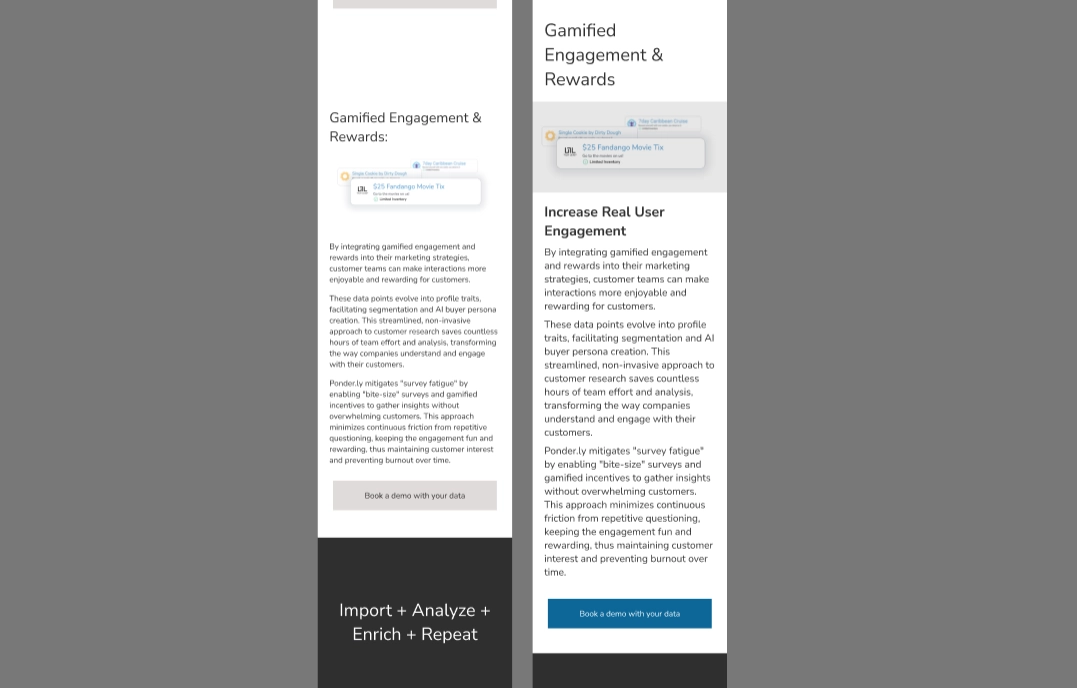
The second area of focus I looked at changing was standardizing similar elements across the page. The old version had differently sized headers, body text, buttons, enc; It also suffered from having inconsistent padding and margin on elements. Aligning these elements helped to create a more consistent and unified experience across the entire page.
My last area of focus was adding overlays to images, redesigning buttons, and recoloring text to help the visually impaired. I added a slight 20% overlay -gradient for mobile- to the images to help them be defined and effortlessly standout. I changed the call to action buttons so that the text was slightly bigger and made the background the same color as the ponder.ly accent #0D6799. This helped the buttons to be unified with the site while also helping them to draw attention to themselves. On the old design, text found on top of a dark background was sometimes given a grayish color, which made them very hard to read. In the redesign, all text found on a dark background was given the same whitish color that was easy to read.

Final Design
When compiling the final design, I worked from top to bottom by implementing the new standardization and switching out individual components to their new versions. While doing so, I focused on creating the mobile version first, due to the majority of visitors being those using their phones. I then adjusted the final mobile version into a desktop version so that a responsive design could be used to fit any screen. Once I had finished the design I presented it to the Ponder.ly management team, where feedback included making certain headers larger on mobile devices and adjusting image overlays to be slightly more transparent-but was overall positive and extremely happy with changes that would help those who were visually impaired to use their website.
I also shared these wireframes with peers and teachers to gather feedback on what worked and what didn't. With feedback incorporated into the different wireframes, I combined what worked best into a final wireframe that could be used to create surface comps.
Handoff to the Developer
Before sending the finished final design over to the developer, I first went through Figma and made sure everything was lined up with the grid, comments and explanations for design decisions were easily understandable, and added code examples for how things could be implemented. Along with sending a Figma file link, I also included a link to a dropbox filled with the resized Images, the svg of the Ponder.ly logo, as well as the Illustrator file in case any changes needed to be made.

Conclusion
I redesigned the homepage for Ponder.ly to be easy to implement, better for those with accessibility issues, decrease loading times, and improve the overall unity of the website. I concentrated my work on making sure their overall message was preserved and highlighted, and that anyone looking at Ponder.ly would be able to quickly find and understand what services they offer. The standardization rules and guidelines for images, when put into place for the entire website, will help them to improve the user experience.